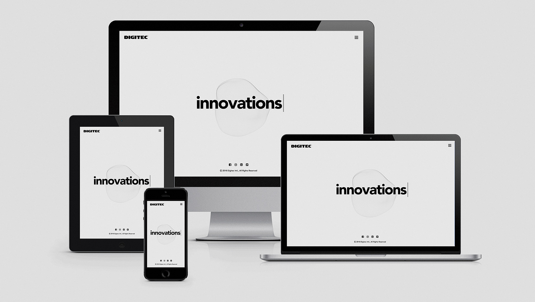
Responsive Design: How to Tell if Your Website Has One
Being mobile-friendly is not enough for a website anymore. Is your site accessible for all kinds of devices? Small and large displays, landscape and portrait mode, do you provide it all? In other words, do you have a responsive design?
It seems as though everyone nowadays has a smartphone, it is essential for the modern person. So consequently, mobile users account for around 60% of internet users. This number keeps changing, and people have invented responsive design to be able to use a website on any device with any display size and ratio. But a lot of people still end up not taking into account the mobile users’ needs when creating their websites. Obviously, it is not any better if you create websites only for mobile users. Why not create equally accessible design for all users?
Responsive web designs are becoming more and more popular and they should be. If your website is responsive, that means your layout adapts depending on the ratio of the device being used. So how can you check whether your website is responsive or not if you do not already know? And, moreover, keep in mind that if there is a mobile version of a website that does not automatically mean that a website is responsive. There are three main ways to optimize your website for mobile devices; one is to have the same URL but different codes for desktop and mobile and the second is to have essentially two separate websites with the same content. All three of these ways make your website smartphone-optimized but that does not mean they are the same as responsive.
The old-fashioned way
Sure, this might not seem very tech-savvy but it’s not any worse. Just grab a phone or a tablet or whatever you can get a hold of and start looking around. Is it messy? Can you barely read the text and are forced to zoom in? Are the images, simply put, squishing one another? Is it even loading properly? And one more important thing: clickable parts shouldn’t be too close to each other so that you can click on the right one.
Toggle Device Toolbar
Now if you, understandably, do not have all the devices available, you can use this nifty little trick called toggle device toolbar; with this tool, you can view your web page as pretty much any device you want and check whether your design is responding properly. To access it, you need to simply right click whilst on your desired website, then click Inspect. In the upper left corner you will see an icon that looks like two different sized mobile devices and when you click on it, you will be able to switch what device you want to view the website as. As a default, there are nine available and those are mainly apple devices; however, you can easily add as many as you like when you click edit.
The Mobile-Friendly Test
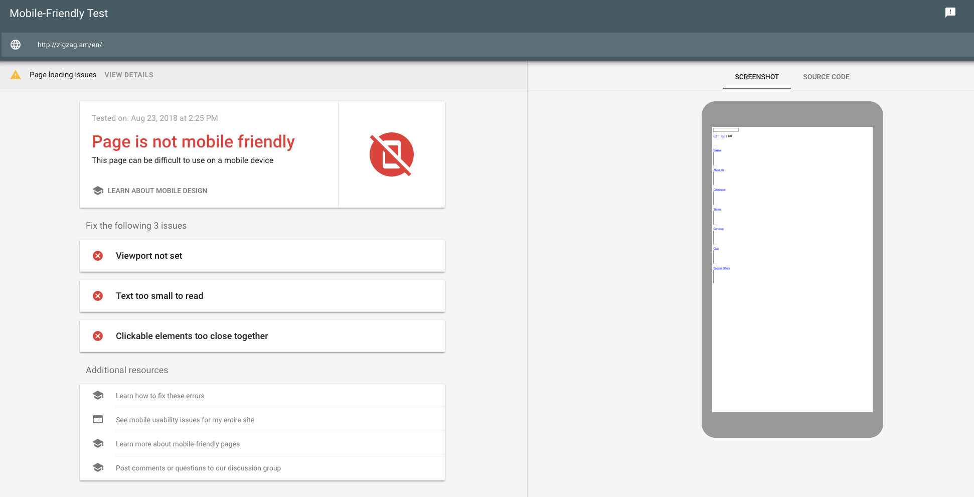
You can also use Google’s mobile-friendly test which checks whether your website is, surprisingly enough, mobile-friendly or not. Not only that, but it also specifies what issues exactly it found; maybe the text is too small or the viewport is not set or the clickable elements are too close together. Whatever it is, the page also provides additional resources about mobile-friendliness and how to fix the issues that came up.
Now, whether you end up spending hours literally testing your website on every single mobile device or you just take a 30-second test, you need to take those results and improve your website. It is the age of smartphones, tablets and god knows what else and websites that do not accommodate for mobile users need to change that quickly. Digitec Intl is careful to do just that, we care about all our users including those using mobile devices. Any website we work on, we develop with care and attention to details.
