I really doubt you are one of those lucky people who never went on a website and spent more time than they should have, trying to find a certain section. But if you are not one of those lucky individuals then congratulations, my friend, you have fallen victim to a bad UI/UX design.
User Interface and User Experience define the way a person interacts with a website. If the website is the company’s home, then the website’s UI/UX design is what makes you feel welcome there. That warmness is achieved through the logical and coherent structuring of the website.
It is important to remember USERS is always the keyword for when it comes to web design. That is why building a great website is not only about how beautiful it looks (Amazon and Reddit being the best examples) or how cool a function sounds. It is about how well all of the elements come together to create a sense of flow.
But mistakes happen. Sometimes, the designer is the one to blame; some other times, the fault is on badly given instructions. Regardless, we know for sure that you hardly want your website to fall under this category. To help you avoid this, here is a list of common mistakes that lead to bad UI/UX solutions and were probably responsible for the horrible experiences you might have had.
1. Attachment to the Design
Generally, it is thought that it takes 18 months to build and design a website. So no wonder UI/UX designers sometimes feel attached to their work. They pour their hearts and souls into the process and do not want their work to be easily dismissed. But it is not enough to like your ‘child’ — it needs to serve a purpose, and if that’s not the case, then it needs to go. Over-attachment to something that does not work well can easily lead to bad UI/UX design.
2. Non-Functioning Solutions
Not all functionalities and interface solutions perform equally well. Some of them are known as last-resort UI elements. You are probably familiar with some of them — the frequently used dropdowns and hamburger menus are among them. They need to be implemented only if none of the other solutions can perform the same action better.

Even though it might seem like it should not make that big of a difference, a simple change like that can drastically influence the performance of a website. Facebook, for example, saw a significant increase in app engagement after the company changed the interface of its main menu. The experience became more smooth and intuitive — we bet you probably felt the influence yourself.
3. Norman Door Solutions
Now, let’s talk about the infamous Norman door that probably got you into many awkward situations. The door that you have no idea what to do with – to push or to pull. You might have felt like an idiot, but the truth is it’s not you — it’s the door.

Similarly, some UI/UX elements are just… there. They only remotely hint the users at how they should be used. Remember the ‘handwriting’ sign in google translator? It said nothing about the function and only confused everyone. Even though what it did was awesome, people rarely used it. The sad truth is no matter how great functionality is, if people do not use it, it is useless. That is why it is so important for designers to always make sure that people understand how to use them. Which means testing, testing, and more testing.

4. Information Overload
Information Architecture or IA is a systematic organization of the information that helps improve its understanding. If the website does not care about its structures then it is going to get messy and overload the audience with information. Unnecessary complexity is not clever— it is a sign of a bad UI/UX that only creates problems. The designer should always be looking for a better and simpler way of presenting something.

Look at this mess that was the landing page of The New York Times. That means that not even big companies are immune to mistakes. Problems like this are where the creativity of a UI/UX designer should kick in. It is the designer’s job to ensure that the website is easy to navigate.
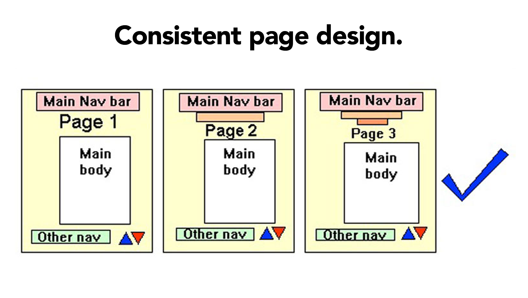
5. Inconsistencies
The other common mistake that might scare people off your website is the visual, thematical, and informational inconsistencies. No matter how tempting it is to cram all the cool things into a website, a good designer is never going to do that. All the UI/UX elements should say something about the brand, and all changes should stem from its main message.
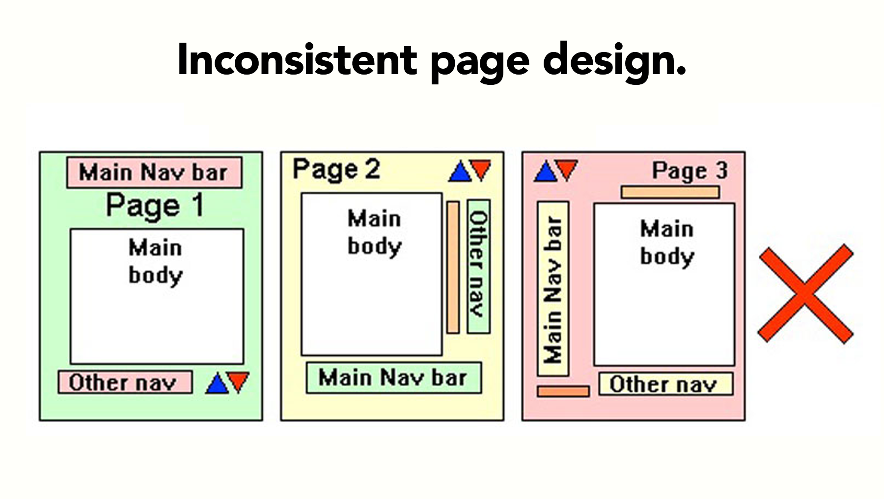
Bad UI/UX ignores the audience, good UI/UX makes them a priority. That is why even small changes in the interface should follow a defined logic, and be consistent with the brand’s message.
Beware of Bad UI/UX
As a business owner, you most likely would not like it if the first thing people did when they visited your website was clicking away. You would rather prefer for the experience they have to be as seamless and natural as it is possible. It is a sad truth that all good designer know about — when something is well-designed, you are not supposed to notice it.
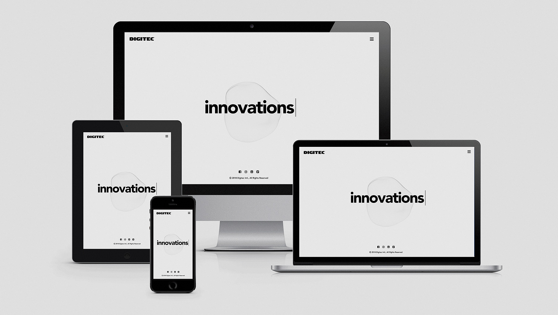
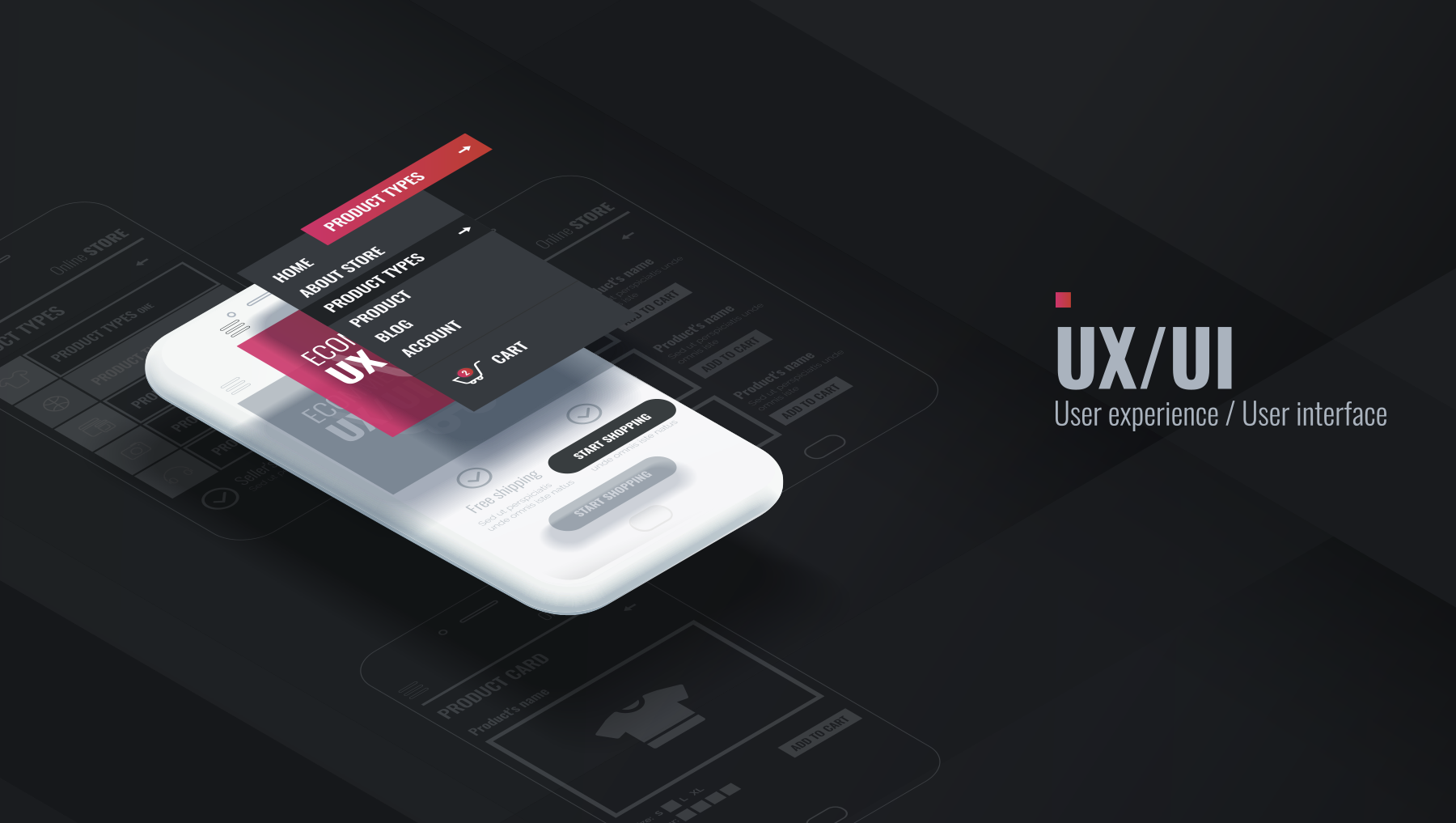
Creating intuitive and easy to use websites is what we do at Digitec. Our UI/UX designers strive to build applications, games, and websites that are responsive and smooth. The team knows how much a good UI/UX can transform the visitor’s experience with the website. They carefully avoid all the mistakes and develop design solutions that bring out the best in a brand.
Contact us if that is what you are looking for. Tell us about your product, brand, and ideas and our designers will develop the right solution for you. The website and application will not only look beautiful, but they will also become part of your company’s identity. While you are here, take a look at the projects we have already completed by clicking here to view our portfolio.
Summary
Article Name
Bad UI/UX: How to Scare People Away From Your Website
Description
The website is a brand's home, and its UI/UX design is what makes people feel welcomed there. If you want the visitors to have a good experience here is a list of very bad UI/UX solutions that you should be carefully avoiding.
Author
Maryam Israelyan
Publisher Name
Digitec
Publisher Logo


 Shaghik Gevorgyan