Learning from Top eCommerce Sites How to Do It Right
How can you rise on the pedestal called ‘successful eCommerce business’ and build a website that people would want to come back to? We share the secrets.

In 1993, the richest man on Earth was just a man with a dream to create a profitable book shop. Little did Jeff Bezos know that his new venture — Amazon — would revolutionize the way we buy and sell. Only two decades later his company would become the top eCommerce site, completely transforming the online business landscape.
While it would be almost impossible to replicate Amazon’s success, the world has never been more ready for any kind of eCommerce business more than it is now. When almost every person knows how to make purchases online, building a well-performing eCommerce business is not impossible.
And what is the best way to go about it? Well, we would say it is learning from the successes (and failures) of the best. So let’s start from the beginning.
First, there was an idea…
1. Ideas matter
All the great eCommerce businesses are driven by an idea.
Some of them, like Walmart, have tried to realize a more conventional concept of shopping. In its core, it is a digital replica of its offline sibling and that is its main idea. Everything else is based on that care concept — Walmart replicated all the existing items with a similar pricing strategy and navigation. The website’s goal is to make it easy to find products, both online and offline.

The ideas are the driving force behind all the other top eCommerce sites. Think Amazon, Etsy, and even Craigslist. They are great and unique because they have built their business around a concept that would solve a problem or meet a need, people have. They have branded themselves around those ideas and done made it their selling point, rarely deviating from their core message.
Of course, it need not be as grandiose as one of those tech giants. It will depend on the service you offer. Are you selling glasses? Look at Owl’s website. Selling food? Then head over to Aida Eats for and inspiration. Both websites make it easy to understand what the website is about right away and that is what you want to achieve. So, before you do anything else — develop a concept.
2. Experience
We couldn’t fully cover the concept without mentioning the UX and UI design of the websites. While functionality might not be exactly the most important point, how smooth it runs, and easy, it is a priority for many top eCommerce sites.
Not only is it difficult to navigate websites with a bad design, but they also don’t inspire trust. And, considering that eCommerce imply lots of transactions, you definitely don’t want to treat its trustworthiness as an afterthought.

When we were developing a website for Dubaiprint.com, its usability, aka UX and its UI, was our focus. Why? Well, our experience showed that people pay a lot of attention to the way the website is structured. If it is confusing, people don’t come back again.
At the same time, when the website is functional, people cannot exactly put their finger on what makes it great. Nonetheless, they are coming back to it. That is the effect you want to achieve.
3. Accessible copy
Top eCommerce sites have adopted a minimalistic approach for copies. The show, don’t tell seems to be a running motto amongst the industry giants.
The approach makes sense. With shorter attention spans, you need to know how to tell more with less. While images are universal, language is not. Of course, you can always translate the website in multiple languages, but with frequent updates and changes, the approach doesn’t seem to be resourceful. And now, when websites become more and more intuitive, the need for long copies is slowly disappearing.

It doesn’t mean, however, that you should stop caring about your text. It’s the other way around. Yes, there are fewer things copies need to be deliberate, delivering on the messages you have without a mistake. All of them need to be direct and to the point, saying exactly what needs to be said, no less, no more.
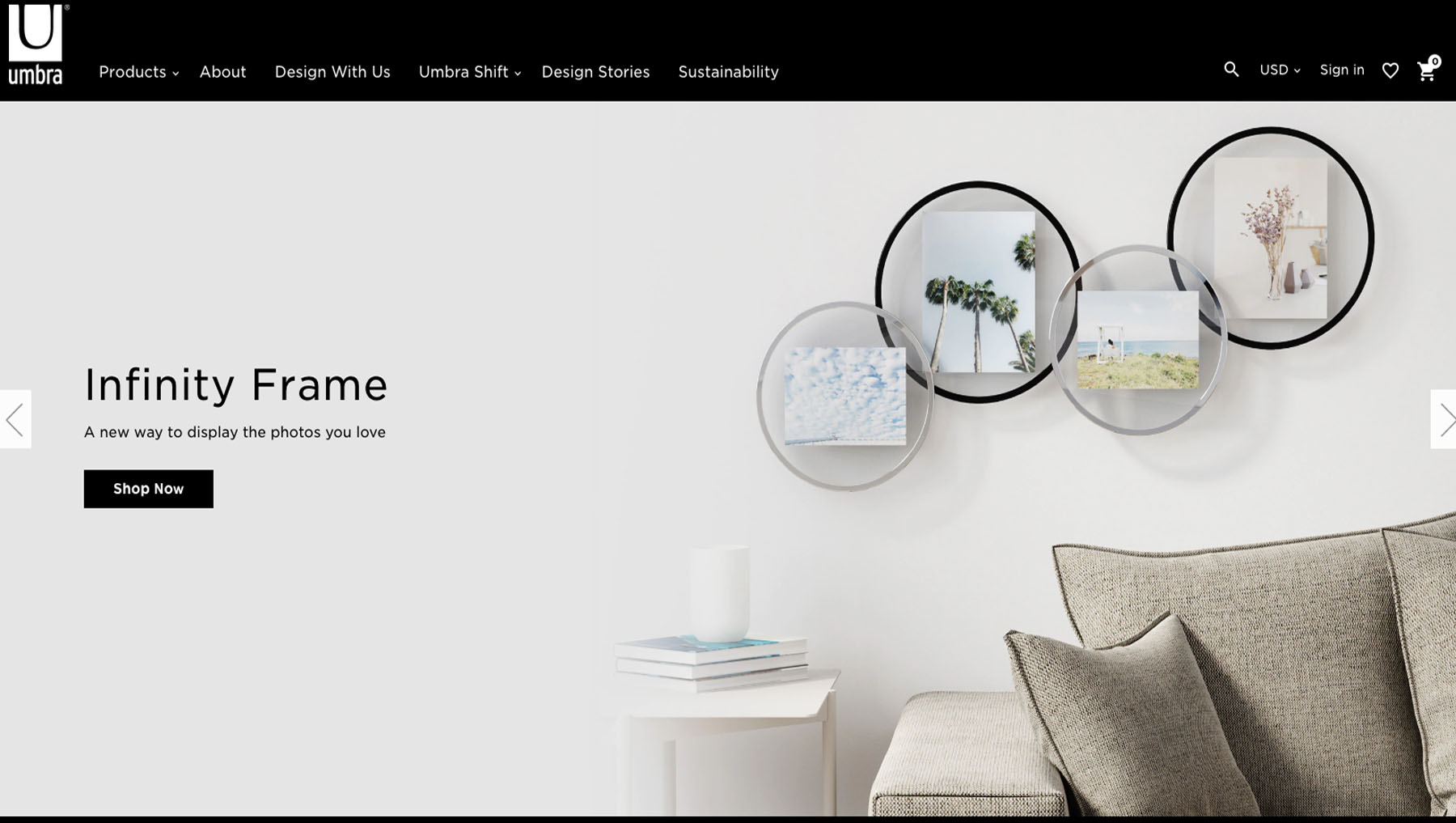
Large heading, creative but short CTAs, and icons are all in the trend. And if you are looking for inspiration, we would suggest you visit Umbra’s website. They have done a great job using the approach.
4. CX (Customer Experience)
Here is a scenario. Imagine you have stumbled upon a website that looks great. The website is awesome; the products are awesome, and you can’t wait to make a purchase. You check out, and things happen: the checkout doesn’t work, or the products delivered a month later.
We assure you, those last unpleasant bits (and consequently most important) will be the only ones you remember and thus the only ones that matter. The beauty of your products is temporary and will be forgotten in a matter of minutes.

Many eCommerce brands focus too much on building the websites, putting on pretty pictures, and forget about the actual commerce part of the brand. And it is a huge mistake, customer experience is not a bother — you should treat it as an essential part of the brand.
As one of the aspiring top eCommerce sites, your main goal is to sell. Remember that ultimately, customers want to have a good experience. Especially if they have already bought your product and all they have to do is to make the purchase. To act upon it, always back up the pretty images with quality services.
Think Warby Parker. They have been making quite a noise in the world of retail thanks to their exceptional customer service. Not only do they have a great website with videos and images to help you understand which type would suit you better, but they also offer a unique service. You can pick five pairs, try them all out, and give back the ones that didn’t suit you with no fees. While slightly counterintuitive, all of it should be part of your brand, part of your ‘eCommerce website.’
5. Big gestures
Most of the modern websites have large images, large easy-to-read types, simple navigation with easy to find icons. It is not only made for an easy navigation website but also feels immersive and ecstatic.
Again, it is not something every company should do, but it has been a trend amongst many top eCommerce sites.

They use large images, large easy-to-read types, simple navigation. It eases the navigation and makes it easier to remember the website.
Looking for inspiration? Check out the following websites: Two Chips. It is a brand of coffee that probably has the most beautiful website from the ones we have seen. It has large images, large buttons, simple copy, and beautiful font. Goals, as they say.
6. Put yourself forward
Above, we have mainly mentioned things that happen on the site. Now, let’s move to the things that happen off of it.
Digital marketing and even traditional marketing should still play a big role in your business plan. You should market yourself right. Otherwise, your beautiful website will be lost in the piles of many (we have seen it happen too many times before).

Having a strong content strategy is a must. Taking care of its SEO is just as important. Social media is a must. PR isn’t off the radar too.
To make your website work, you need to promote it in the right way. Don’t neglect your online presence is you don’t want to be neglected.
And we could not talk about top eCommerce sites without talking about Amazon. The company seems to top about any product-related inquiries in search engines, continuously reinforcing its position as the king of all things eCommerce.
7. Brag!
While humility is a virtue, the only place you should forget about is your website.
Brag, brag, and brag if you have something to be proud of. Do so shamelessly, strategically, and shameless.

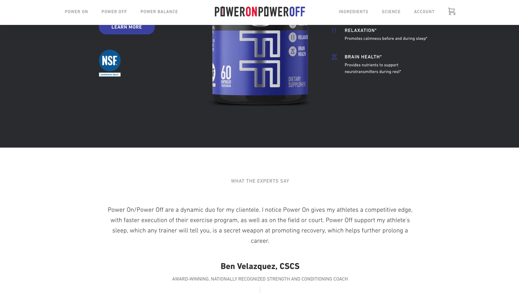
Put your collaborations online. Kindly ask your customers to talk about you and maybe give you some feedback. Remember, the only thing better than bragging yourself is letting other people do it for you. Of course, the format you choose will largely depend on the shop you have been set up.
Need an example? Get one from PowerOnPowerOff. Their minimalistic website is beautiful beyond imagination, but the small line at the bottom does the real job.
The principle behind it is simple. If big names trust them… Why shouldn’t you?
Now, put it all together.
You might have noticed some patterns in the way eCommerce is done right now. It is moving toward image centered websites with a creative and short call to actions. But it is not all about the looks. The service, marketing, and all should be in place to bring the website the success it wants.
eCommerce is a small ecosystem where you are the designer. And it’s both a power and a responsibility you need to use wisely.


